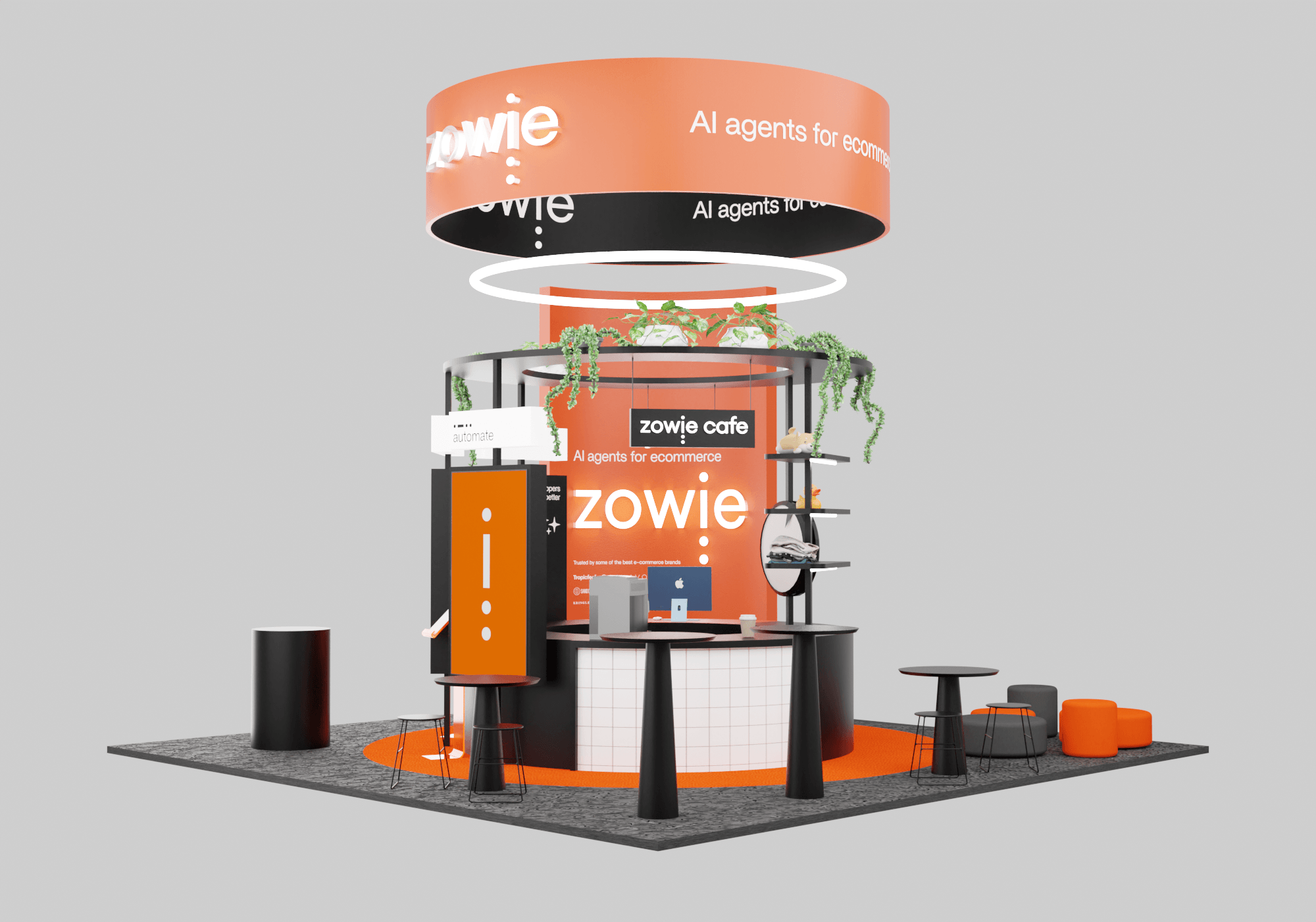
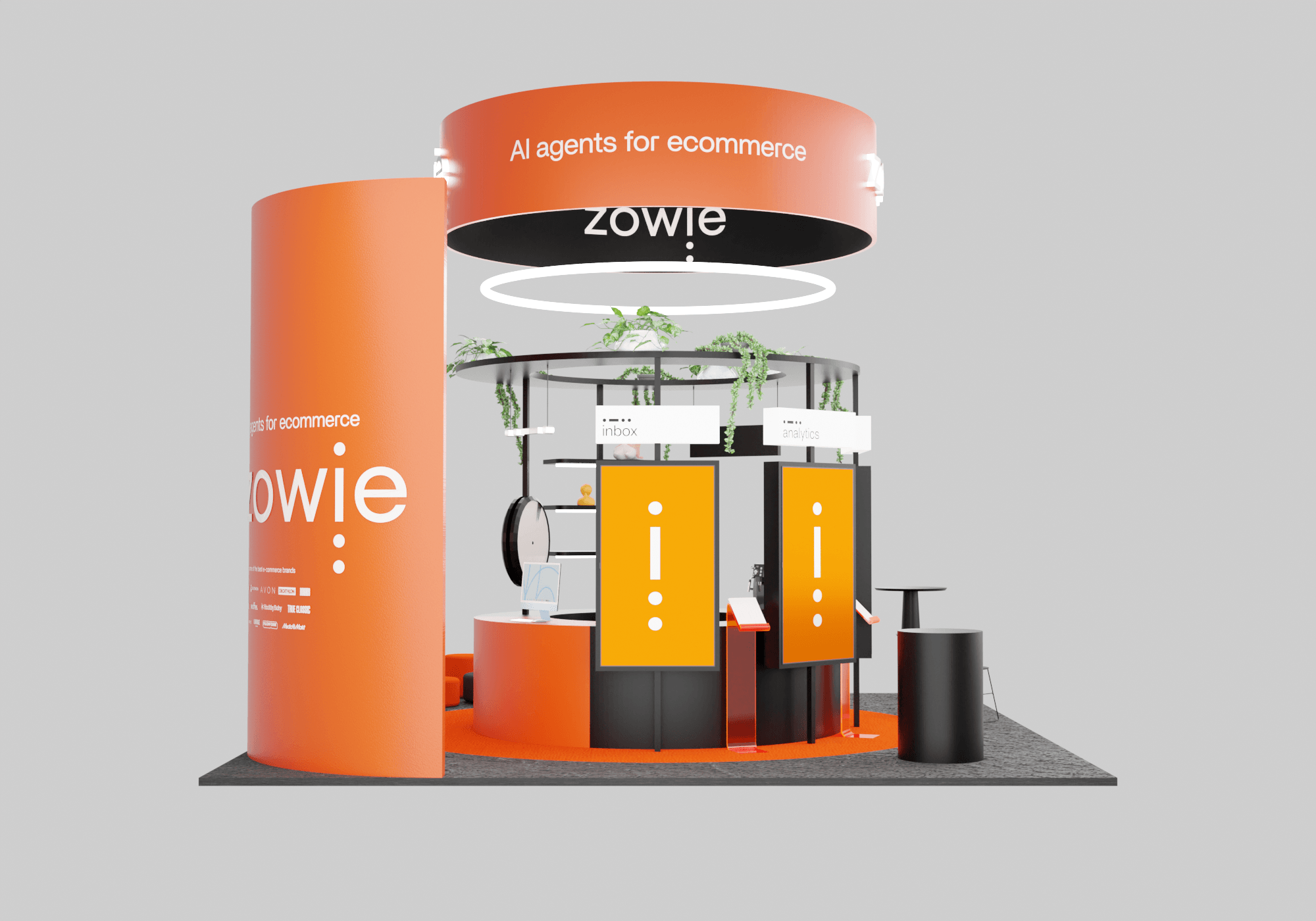
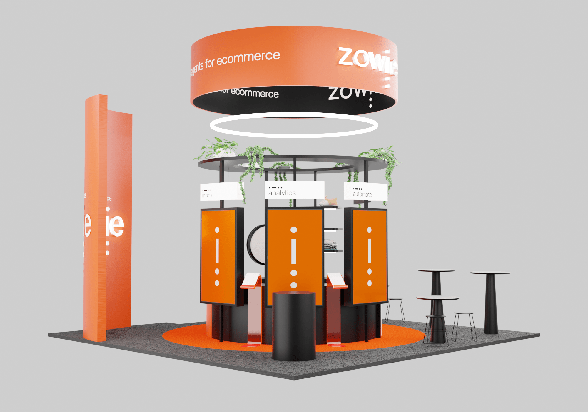
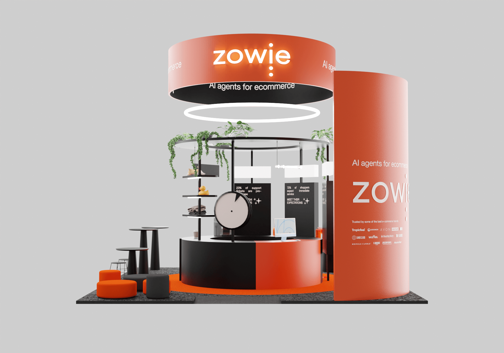
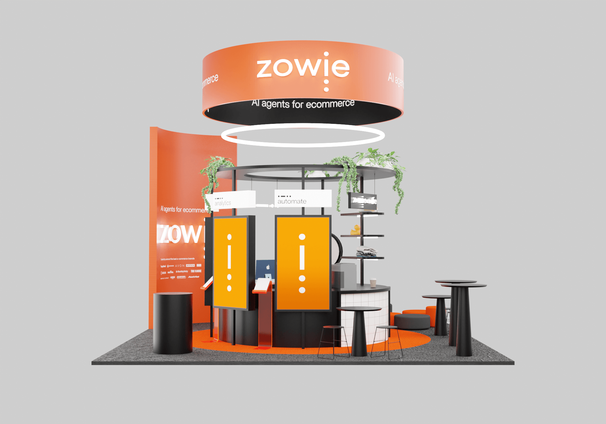
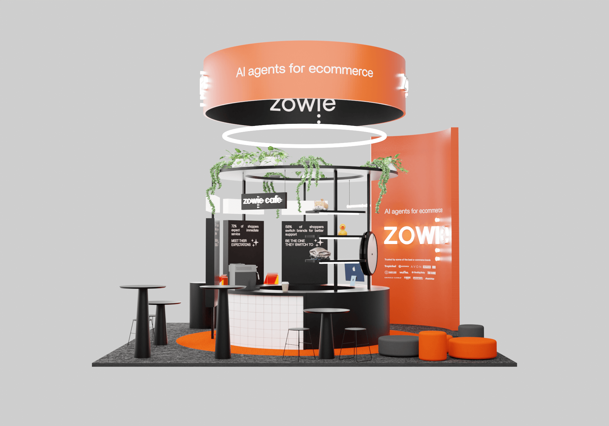
When I joined Zowie there was a sense that the visual identity of the company was stuck. Particularly, it used a combination of colours, fonts and design elements that made it feel too consumer-led, at a time when the business was pivoting toward serving Enterprise customers.
In order to minimise business disruption while achieving the goal of modernising the brand to better reflect product evolution and new ICP I, along with my team, strategically updated fonts, colours, and design system elements such as buttons, iconography and product mock-ups, resulting in a more ownable visual identity that better suited new business goals.

.jpg)


.png)